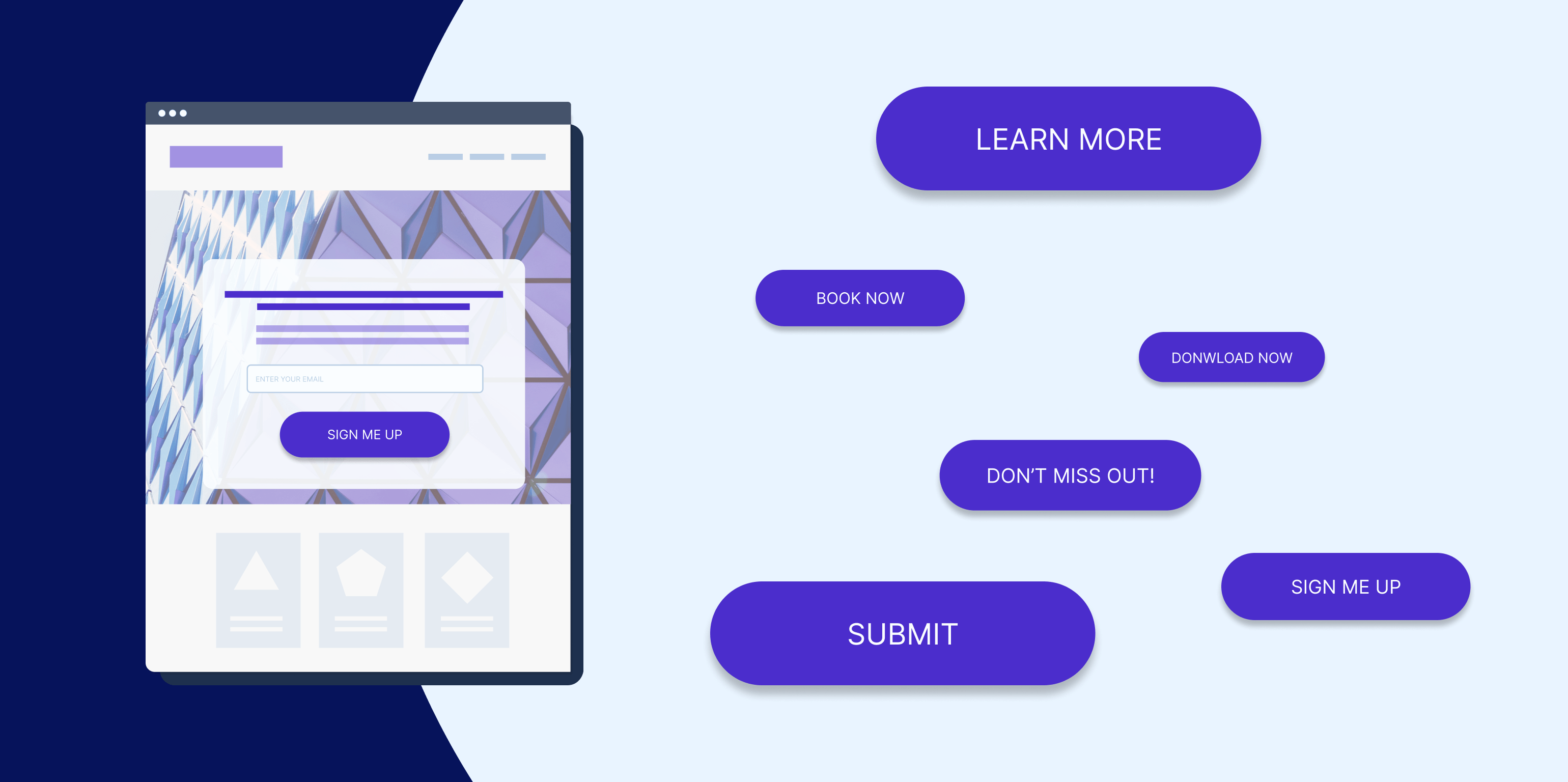

Call-to-action (CTA) buttons are essential elements in web design that guide users towards desired actions. Whether it’s making a purchase, signing up for a newsletter, or downloading an app, a well-designed CTA button can significantly impact the success of a website. In this article, we will explore key principles and best practices for creating effective call-to-action buttons in web design.
- Clear and Concise Copy: The text on a CTA button should be clear, concise, and action-oriented. Use strong action verbs and concise phrases that convey the desired action. For example, instead of using “Learn More,” try “Get Started” or “Join Now.” Be specific and avoid ambiguity to ensure users understand what action they are taking.
- Prominent Placement: The placement of a CTA button is crucial for grabbing users’ attention. Position the button prominently on the page, preferably above the fold, where it is visible without scrolling. Make sure it stands out from other elements by using contrasting colors, size, or whitespace around the button.
- Attention-Grabbing Design: The visual design of a CTA button should be eye-catching and visually appealing. Use contrasting colors that complement your overall design scheme to make the button stand out. Employ white space effectively to draw attention to the button and avoid cluttered surroundings. Experiment with different button shapes, sizes, and styles to find what works best for your website.
- Compelling and Urgent Language: Create a sense of urgency or exclusivity with your CTA button’s language to entice users to take immediate action. Phrases like “Limited Time Offer,” “Exclusive Access,” or “Join Now for a Special Discount” can motivate users to click the button. However, avoid using misleading or false urgency, as it can harm your website’s credibility.
- Mobile-Friendly Responsiveness: With the increasing use of mobile devices, it is crucial to ensure that your CTA buttons are mobile-friendly. Design buttons with an appropriate size that can be easily tapped on smaller screens. Optimize the layout and spacing to provide a seamless user experience across different devices.
- Use Contrasting Colors: Choosing the right color for your CTA button is essential to make it stand out. Use colors that contrast with the background and other elements on the page to draw attention. Consider using color psychology to evoke desired emotions or associations. For example, red can signify urgency or importance, while green can represent success or positive actions.
- A/B Testing and Iteration: Designing effective CTAs requires continuous experimentation and optimization. Conduct A/B tests with different button designs, placements, and copy to determine what resonates best with your audience. Analyze the data and iterate based on user behavior and conversion rates. Small changes can make a significant difference in improving the effectiveness of your call-to-action buttons.
- Clear Visual Feedback: Provide visual feedback to users when they interact with your CTA button. This feedback can be in the form of a hover effect, color change, or animation. Visual cues reassure users that their action has been recognized, which can boost their confidence in proceeding further.
In conclusion, creating effective call-to-action buttons in web design requires careful consideration of various factors. By using clear and concise copy, prominent placement, attention-grabbing design, compelling language, mobile-friendly responsiveness, contrasting colors, A/B testing, and clear visual feedback, you can optimize the effectiveness of your CTAs and enhance user engagement and conversion rates on your website. Remember to continuously monitor and refine your CTA buttons based on user feedback and analytics to achieve the desired results.