
Typography plays a pivotal role in web design, as it significantly affects the readability, user experience, and overall aesthetics of a website. With the ever-evolving landscape of web development, understanding the principles and best practices of web typography has become crucial for designers and developers alike. This article aims to explore the world of web typography, discussing key considerations and tips for creating visually appealing and legible text on the web.
- Typeface Selection: Choosing the right typeface is the foundation of effective web typography. With the plethora of options available, it’s essential to consider factors such as readability, compatibility, and the overall tone of the website. Web-safe fonts like Arial, Helvetica, and Times New Roman ensure consistent rendering across different browsers and devices. However, with the advent of web font services like Google Fonts and Typekit, designers now have a vast library of web fonts at their disposal.
- Readability and Hierarchy: Legibility should be the primary goal when selecting typefaces and organizing content. The chosen font should be easy to read, even at smaller sizes. Sans-serif fonts are generally preferred for body text due to their clean and modern look, while serif fonts can be used for headings and titles to add emphasis and hierarchy. Maintaining a clear typographic hierarchy through font sizes, styles, and spacing helps users navigate the content effortlessly.
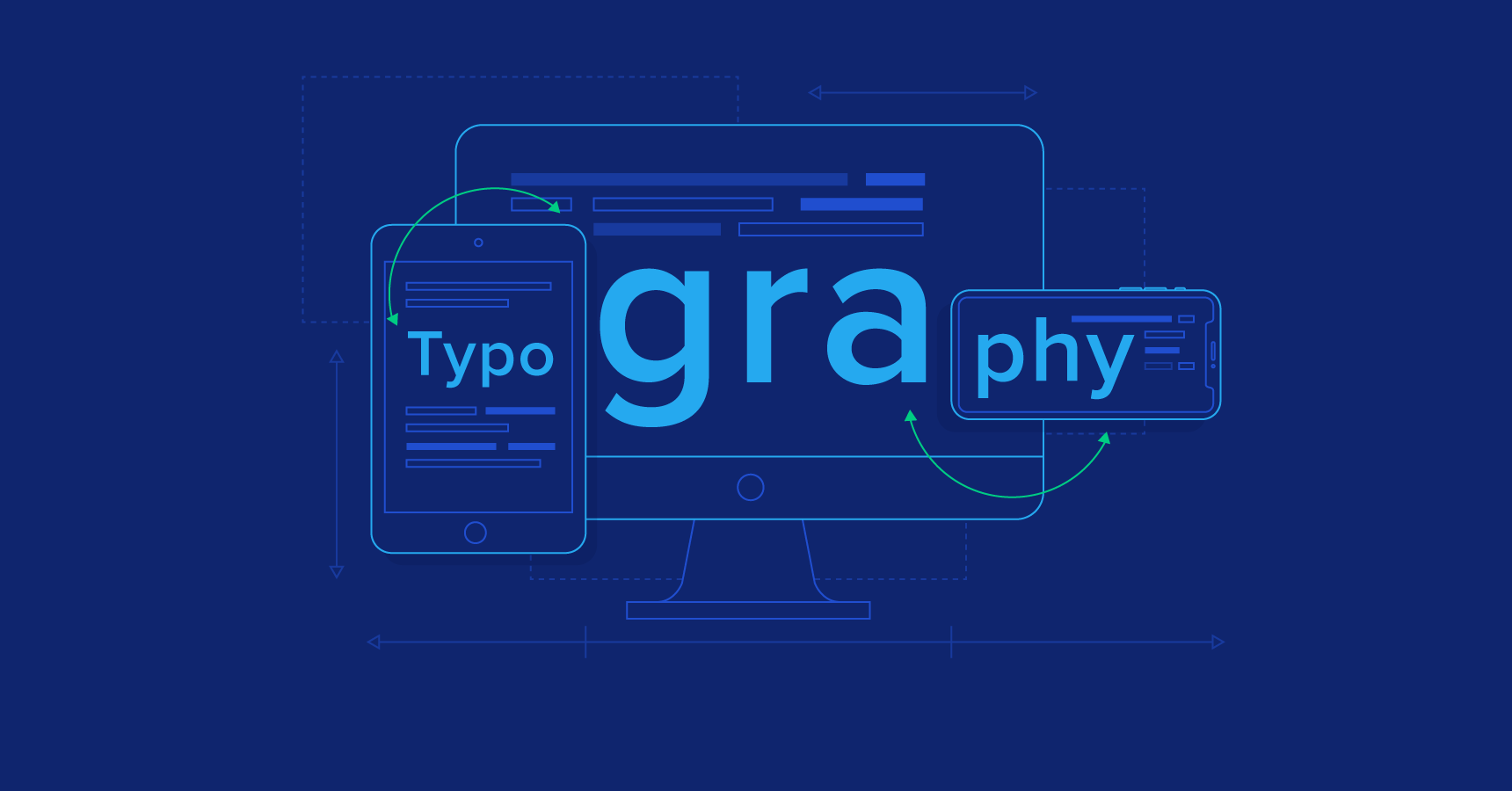
- Responsive Typography: With the rise of mobile devices, responsive design has become essential. Implementing responsive typography ensures that text adjusts appropriately to different screen sizes. Techniques such as fluid typography, which uses relative units like percentages and ems, enable the text to scale proportionally, offering an optimal reading experience across devices.
- Line Length and Line Spacing: The length of a line of text significantly affects readability. Long lines can be tiring to read, while short lines can disrupt the flow. It is recommended to keep the line length between 45-75 characters per line, including spaces. Adequate line spacing, or leading, also plays a crucial role in legibility. Optimal line spacing allows for comfortable reading and prevents the text from appearing cramped or suffocated.
- Contrast and Color: The contrast between the text and the background is essential for readability. High contrast ensures that the text stands out and is easily legible. When selecting colors, consider color blindness and ensure that the text remains distinguishable for users with different visual abilities. Tools like Web Content Accessibility Guidelines (WCAG) provide guidelines for color contrast ratios to ensure accessibility compliance.
- Pairing Typefaces: Pairing typefaces can add visual interest and create a harmonious design. When combining fonts, consider contrast and compatibility. Contrasting typefaces, such as a serif and a sans-serif, can create a dynamic effect, while pairing similar typefaces can establish a cohesive and elegant look. It is important to strike a balance and avoid overwhelming the design with too many different typefaces.
- Use of White Space: White space, or negative space, is the area between elements in a design. It helps create visual breathing room and improves readability. Employing adequate white space around paragraphs, headings, and other textual elements enhances clarity and prevents the content from feeling cluttered. It also draws attention to important information and improves the overall user experience.
In conclusion, web typography plays a vital role in shaping the aesthetics and readability of websites. By carefully selecting appropriate typefaces, considering readability factors, implementing responsive techniques, and paying attention to contrast and white space, designers can create visually appealing and user-friendly typographic experiences on the web. Understanding and mastering the art of web typography allows for effective communication and enhances the overall impact of a website’s design.